Color is one of the most powerful tools at an artist’s disposal. From the vibrant hues of a sunrise to the subtle tones of a twilight sky, color envelops our world and influences our perceptions. Understanding color theory is key to unlocking an artist’s full potential as it provides a scientific and emotional framework for making impactful color choices.
At its core, color theory delves into the principles and guidelines artists use to communicate through color. It begins with the color wheel, a visual representation of primary, secondary, and tertiary colors. Primary colors—red, blue, and yellow—are the foundation from which other colors are mixed. Secondary colors, such as green, orange, and purple, result from mixing primary colors in various combinations, and tertiary colors are formed by combining primary with secondary colors.
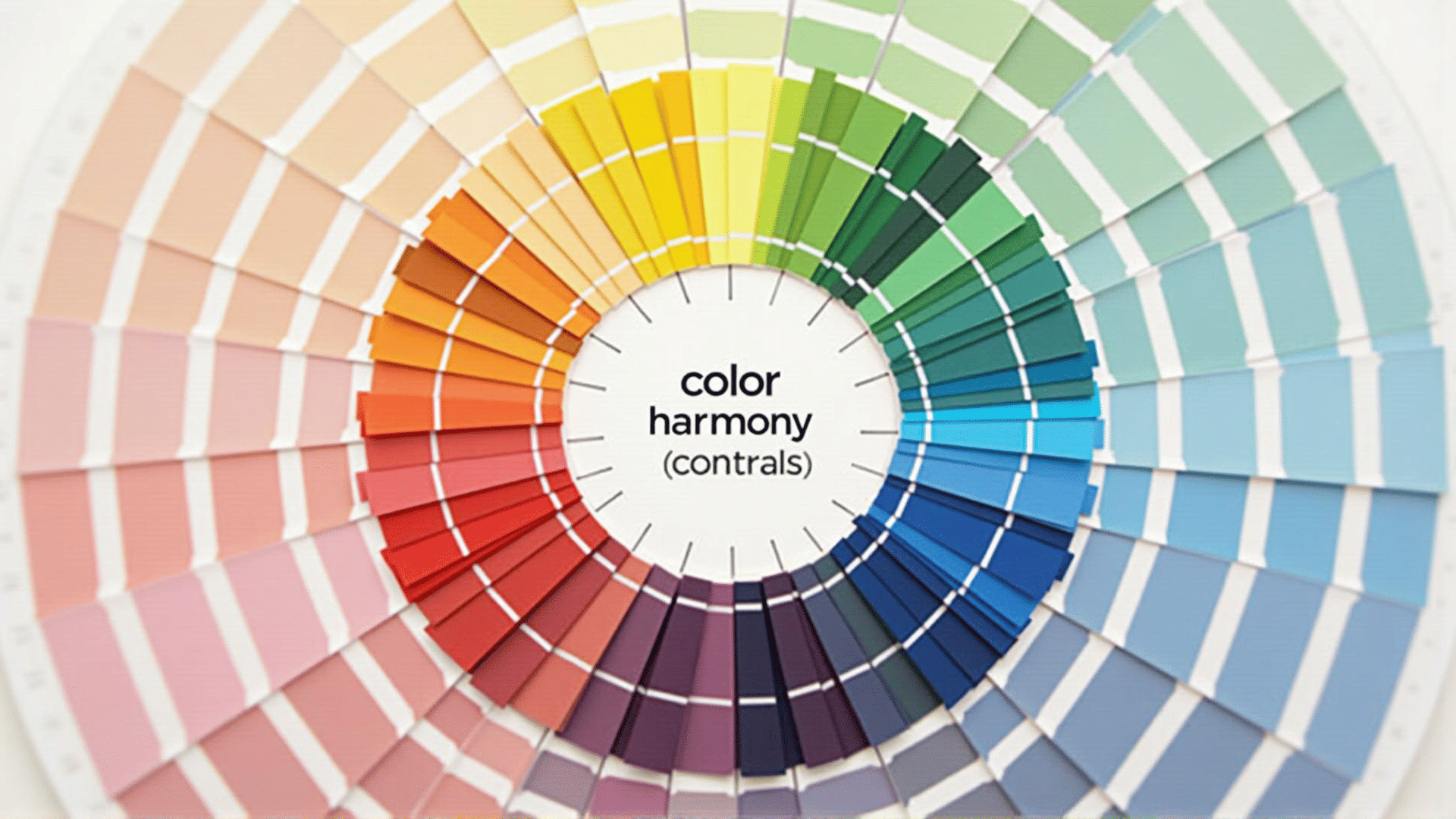
One fundamental aspect of color theory is the concept of harmony. Harmonious color combinations are pleasing to the eye and can create balance and unity in a piece of art. Artists often employ schemes such as complementary, analogous, and triadic color schemes to achieve harmony. Complementary colors stand opposite each other on the color wheel, such as blue and orange, creating contrast and vibrant energy when used together. Analogous colors sit next to each other, like red, orange, and yellow, providing a sense of calm and cohesion. Triadic colors, evenly spaced on the wheel, like red, blue, and yellow, offer visual interest and balance.
Beyond harmony, color theory touches upon the impact of color on mood and perception. Warm colors like red, orange, and yellow can evoke feelings of warmth, excitement, and passion. In contrast, cool colors like blue and green can be calming and soothing. Artists leverage these emotional responses to convey specific feelings or atmospheres in their work—whether the intensity of a dramatic scene or the tranquility of a peaceful landscape.
Furthermore, the cultural and historical context of colors enhances their significance. Color meanings can vary widely across different cultures and time periods. For instance, while white often symbolizes purity in Western cultures, it may represent mourning in some Eastern cultures. Understanding these contexts can enrich an artist’s storytelling and connect more deeply with diverse audiences.
Color theory also involves understanding the technical aspects of color mixing and application. Mastery over hues, saturation, and value allows artists to create depth and dimension, manipulate light and shadow, and guide the viewer’s gaze across the canvas. Skillful use of contrasting and harmonious colors can lead the eye to focal points, emphasizing critical elements of the composition.
In contemporary design, the principles of color theory extend beyond traditional art into fields such as digital media, fashion, and interior design, where color continues to play a pivotal role in shaping aesthetics and user experience. Artists and designers alike draw on these foundational principles to make informed decisions that enhance the effectiveness and beauty of their work.
In summary, color theory is an essential pillar of the creative process, equipping artists with the knowledge to craft visually compelling pieces that resonate on both cognitive and emotional levels. By understanding color relationships and their psychological impact, artists can create art that not only captivates the eye but also speaks to the soul.