Color plays a pivotal role in how we perceive and interact with the world around us. It can evoke emotions, establish hierarchy within a design, and create harmony or tension. Understanding how color influences mood and order within visual compositions is essential for anyone looking to develop effective and aesthetically pleasing work.
To delve into this topic, it's important to first recognize that different colors can elicit different emotional responses. Warm colors like red, orange, and yellow are generally energizing and can evoke feelings of warmth and comfort. Red, in particular, is known for its ability to increase excitement and urgency, sometimes even stimulating appetite. In contrast, cool colors such as blue, green, and purple tend to have a calming effect, often associated with tranquility and serenity. Blue is frequently linked to feelings of trust and dependability, making it a popular choice for fostering a sense of security and stability.
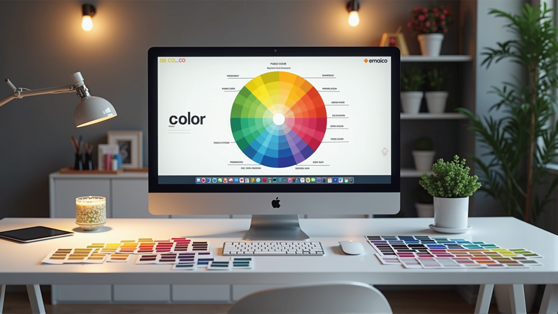
Beyond individual colors, combinations of colors—or color harmony—play a crucial role in design. Harmonious color schemes can be achieved through various techniques, such as complementary, analogous, or triadic schemes. Complementary color schemes involve colors that are opposite each other on the color wheel, such as blue and orange, offering a high-contrast, vibrant look that stands out. Analogous schemes, using colors that are next to each other on the wheel, like blue, blue-green, and green, create a more subtle and cohesive feel. Triadic schemes involve three evenly spaced colors on the wheel, offering a lively yet balanced palette.
Hierarchy in design is greatly influenced by the strategic use of color. Dominant colors can draw immediate attention to the most important elements of a design, acting as visual cues for viewers. For instance, a bright, saturated color can highlight a focal point, while muted tones can serve as background elements, ensuring they don't overwhelm the composition.
Achieving effective color harmony requires an understanding of color theory principles and an awareness of cultural and individual differences in color perception. Experimentation and practice are key to mastering the art of color in design. By exploring various combinations and observing their effects, one can develop a keen sense for using color to influence emotion and hierarchy effectively.
In summary, color is a powerful tool in design, capable of influencing mood and establishing the order of elements within a composition. By understanding basic color theory concepts and experimenting with different schemes, one can craft compelling and harmonious designs that resonate emotionally with the audience.