Understanding the intricacies of arranging type involves balancing both art and science. At its core, this practice aims to make written language not only legible and easy to read but also visually engaging.
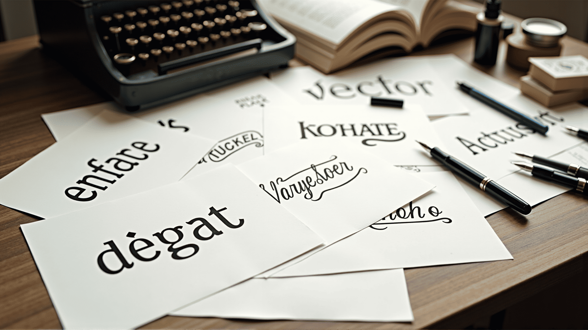
The journey begins with selecting the right typeface. Each font has its unique personality, from the formal elegance of serif options to the modern vibe of sans-serif choices. Picking the right one can substantially affect the tone of the text. Consideration of the message and audience is integral to this choice.
Once a typeface is chosen, it’s time to delve into the size, weight, and spacing. Font size impacts readability, with larger text suiting headlines and smaller sizes fit for body text. Adjusting weight involves playing with the thickness of characters—bold selections can create emphasis, while lighter options can add a nuanced elegance.
Spacing, or leading, is another critical factor. It dictates the vertical distance between lines of text and can dramatically impact readability. Tight spacing may lead to a crowded appearance, while too much space might cause disconnection between lines, disrupting the flow.
Kerning is a more specialized element of spacing, referring to the adjustment of space between individual characters. Proper kerning ensures that the type is visually even, enhancing readability and the overall aesthetic appeal.
Color also plays a pivotal role. The contrast between the text and its background is crucial for legibility. High contrast, such as black text on a white background, is generally easiest to read, but softer contrasts can be used to achieve different moods or effects without sacrificing clarity.
The alignment of text further contributes to its presentation. Left-justified text tends to be the most readable for languages that flow from left to right, while center or right alignment can be used for specific stylistic or thematic effects.
Beyond these technical elements, arranging type is about conveying a narrative, setting a mood, or inviting the reader into a particular experience. It's a harmony of function and artistic expression, where every letter, line, and space plays a part in communicating the deeper message.
By understanding and applying these principles, the art of arranging type transforms from mere mechanics into a robust tool for enhancing communication and expression.